

Introduction
Picture this: You’ve just spent two hours perfecting your website’s design, but somehow, everything looks… off. Elements are misaligned, spacing is inconsistent, and that beautiful button you created is mysteriously pushing other content around. Sound familiar?
Here’s the thing—99% of CSS layout frustrations stem from one fundamental misunderstanding: the box model. It’s the invisible rulebook that governs how every single element on your webpage behaves, from tiny icons to massive hero sections. And once you truly “get” it, CSS stops feeling like black magic and starts making perfect sense.
Today, I’m breaking down the CSS box model in a way that’ll actually stick. No corporate jargon, no unnecessary complexity—just practical knowledge you can use immediately to build cleaner, more predictable layouts.
What Exactly Is the CSS Box Model?
Think of the box model as the anatomy of every HTML element on your page. Whether you’re styling a paragraph, an image, or a complex navigation menu, browsers treat each element as a rectangular box with four distinct layers. Understanding these layers is like getting X-ray vision for web development.
The box model isn’t just theory—it’s the framework your browser uses to calculate spacing, dimensions, and positioning for literally everything you see on a webpage. Master this, and you’ll debug layout issues in seconds instead of hours.
The Four Essential Components That Make or Break Your Layouts
Content: The Heart of Your Element
At the center of every box sits the actual content—your text, images, videos, or whatever information you’re displaying. This is what your users came to see, and everything else exists to present it properly.
The content area’s size is controlled by two properties you’ve definitely used before: width and height. But here’s where beginners often trip up—these properties ONLY define the content area, not the entire element. This distinction becomes critical when you start adding padding and borders.
Real-world example: When you set width: 300px on a product card, you’re saying “I want the content inside to be 300 pixels wide,” not “I want the entire card to be 300 pixels wide.” This misconception causes countless layout bugs.
Padding: Your Element’s Breathing Room
Padding is the transparent space between your content and its border. It’s like the mat around a framed picture—it creates visual separation and prevents your content from feeling cramped.
I’ve reviewed hundreds of websites, and inadequate padding is probably the #1 rookie mistake I see. Too little padding makes your content feel suffocated and hard to read. Too much wastes precious screen real estate. The sweet spot? It depends on your content, but 16-24px is a solid starting point for most text-based elements.
Pro insight: Padding is incredibly powerful for improving click targets on mobile devices. That tiny 32x32px icon becomes much easier to tap when you add padding: 12px, effectively creating a 56x56px touch target.
Borders: The Visual Boundary Line
Borders wrap around your content and padding, creating a visible outline (though they can be invisible too with border: none). They’re more versatile than most developers realize.
Beyond simple outlines, borders are fantastic for creating visual separators, highlighting active states, or building custom UI components. I’ve built entire card interfaces using creative border techniques—no images required.
Design tip: Subtle borders (1px solid #e0e0e0) work wonders for defining sections without being visually aggressive. This is exactly what modern design systems like Material Design and Bootstrap use extensively.
Margins: The Invisible Force Field
Margins create space OUTSIDE your element, separating it from neighboring elements. Unlike padding, margins are completely transparent and never have a background color.
Here’s something that trips up even experienced developers: margins can collapse. When two vertical margins meet, instead of adding together, the larger margin wins. Sounds weird, but it’s actually a feature that prevents excessive spacing in text-heavy content.
Common scenario: You’ve set margin-bottom: 20px on your headings and margin-top: 20px on your paragraphs. The actual space between them? Just 20px, not 40px. This is margin collapse in action.
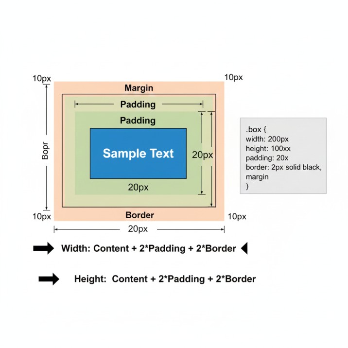
Calculating Total Element Dimensions (The Math That Matters)
This is where theory meets practice. When you need to fit elements into a specific space or align items perfectly, you must understand how browsers calculate total dimensions.
The formulas:
Total Width = Content Width + Left Padding + Right Padding + Left Border + Right Border + Left Margin + Right Margin
Total Height = Content Height + Top Padding + Bottom Padding + Top Border + Bottom Border + Top Margin + Bottom Margin
Let’s work through a real example that mirrors actual development work:
css
.product-card {
    width: 250px;
    height: 350px;
    padding: 20px;
    border: 2px solid #333;
    margin: 10px;
}
What’s the total width this card occupies in your layout?
250px (content) + 20px (left padding) + 20px (right padding) + 2px (left border) + 2px (right border) + 10px (left margin) + 10px (right margin) = 314px
This matters tremendously when you’re building grid layouts or trying to fit three cards across a 940px container. If you assume each card is 250px wide, you’re in for a nasty surprise when the third card wraps to the next line.
The Box-Sizing Property: Your Secret Weapon
Modern CSS developers have a secret that makes box model calculations infinitely easier: the box-sizing property.
By default, browsers use box-sizing: content-box, which means width and height only apply to the content area. This is what causes all that mental math we just did.
But switch to box-sizing: border-box, and suddenly width and height include padding and borders. It’s intuitive, predictable, and exactly how most people naturally think about sizing.For a deep dive into all the technical specifications and browser compatibility details, check out MDN’s comprehensive box model documentation.
Industry best practice:
css
* {
    box-sizing: border-box;
}
This simple rule at the top of your stylesheet eliminates countless headaches. When you set width: 300px with border-box, the element is actually 300px wide—padding and borders included. Revolutionary? No. Life-changing for CSS workflow? Absolutely.
Debugging Box Model Issues Like a Pro
Every browser includes developer tools that visualize the box model for any element. This isn’t just a debugging feature—it’s your roadmap to understanding exactly what’s happening with your layout.
Quick debugging workflow:
- Right-click the problematic element
- Select “Inspect” or “Inspect Element”
- Look for the “Computed” or “Layout” tab
- Find the box model diagram
You’ll see a color-coded visualization showing content (blue), padding (green), border (yellow), and margin (orange). Within seconds, you can identify if excessive margins are pushing elements apart or if forgotten padding is making something too large.
For more visual examples and debugging techniques, CSS-Tricks has an excellent guide with interactive demonstrations that really bring these concepts to life.
Personal anecdote: Last month, I was troubleshooting why a client’s navigation menu had mysterious extra space at the bottom. Inspector revealed a 4px margin on the last list item that we’d completely forgotten about. Two seconds to find, one line to fix. That’s the power of understanding the box model.
Practical Applications: Where Theory Meets Reality
Building Responsive Card Grids
When creating product grids or blog post layouts, box model mastery ensures consistent spacing and perfect alignment. Using box-sizing: border-box lets you use percentage widths confidently, knowing padding won’t break your layout.
Form Design That Doesn’t Suck
Forms are notoriously tricky because inputs, labels, and buttons all need precise alignment. Understanding how padding affects form field appearance vs. how margins control spacing between fields separates amateur forms from professional ones.
Mobile Navigation Menus
Touch targets need to be at least 44x44px for comfortable mobile interaction. You achieve this not by making your icon larger, but by adding strategic padding to increase the clickable area while keeping the visual design clean.
Common Box Model Mistakes (And How to Avoid Them)
Mistake #1: Forgetting about borders and padding when calculating widths Solution: Always use box-sizing: border-box or mentally add padding/border to your width calculations.
Mistake #2: Using margins for internal spacing Solution: Margins are for separation BETWEEN elements. Use padding for space WITHIN elements.
Mistake #3: Fighting margin collapse instead of understanding it Solution: Embrace margin collapse for vertical rhythm in text content. Use padding or borders to prevent it when necessary.
Mistake #4: Not leveraging browser DevTools Solution: Inspect early, inspect often. The box model visualizer is your best friend.
Advanced Tips for Box Model Mastery
- Use logical properties like
padding-inlineandmargin-blockfor better internationalization support - Combine
box-sizing: border-boxwith CSS Grid for incredibly powerful, predictable layouts - Remember that percentages for padding and margin are calculated based on width, even for top/bottom values (yes, really)
- Use
outlineinstead ofborderwhen you need a visual indicator that doesn’t affect layout dimensions
Frequently Asked Questions
Q: Should I always use box-sizing: border-box? For 95% of projects, yes. It makes CSS far more intuitive and eliminates most sizing headaches.
Q: Can margins have negative values? Absolutely! Negative margins are powerful for overlapping elements or pulling content outside its container. Use them carefully.
Q: Why do my horizontal margins not collapse like vertical ones? Margin collapse only happens with vertical (top/bottom) margins, never horizontal (left/right). It’s by design according to the official W3C CSS Box Model specification, which defines how browsers should implement these behaviors.
Q: Does the box model work the same for inline elements? Not quite. Inline elements ignore top/bottom margins and height/width properties. They only respect horizontal margins and padding.
Conclusion: Your Next Steps to Layout Mastery
The CSS box model isn’t glamorous. It’s not trendy. But it’s the foundation upon which every beautiful website is built. Understanding content, padding, borders, and margins—and how they interact—transforms you from someone who accidentally gets CSS working to someone who deliberately crafts pixel-perfect layouts.
Start experimenting today. Open your browser’s DevTools and inspect elements you see on your favorite websites. Notice how professional designers use padding for breathing room, how they leverage margins for consistent spacing, and how they combine all four box model components to create harmonious layouts.
The difference between a developer who “knows” the box model and one who truly understands it is visible in every project they touch.
Ready to level up your CSS skills? Bookmark this guide, practice the concepts with real projects, and watch your development speed and confidence soar. Your future self (and your teammates) will thank you.
Need Expert Help with Your Web Design Project?
Understanding the box model is just the beginning—building pixel-perfect, responsive websites that convert visitors into customers requires experience, strategy, and attention to detail. Our team specializes in crafting custom web solutions that not only look stunning but perform flawlessly across all devices. Whether you’re launching a new brand, redesigning an existing site, or need help fixing persistent layout issues that are costing you conversions, we’ve got you covered. From front-end development and responsive design to performance optimization and ongoing support, we handle the technical complexity so you can focus on growing your business. Ready to transform your web presence? Get in touch for a free consultation and let’s discuss how we can bring your vision to life with clean code, modern design, and measurable results.
Have questions about the box model or want to share your own layout challenges? Drop a comment below or reach out—I’d love to hear about your experiences and help troubleshoot any tricky situations you’re facing.