

Introduction
CSS Flexbox has revolutionized the way developers build responsive layouts. Gone are the days of wrestling with float-based designs, clearfix hacks, and those frustrating late-night debugging sessions trying to center a simple element. Flexbox changed everything.
If you’ve ever struggled with CSS layout challenges—aligning navigation items, creating card grids, or building that perfect three-column design—then understanding CSS Flexbox is your game-changer. This powerful one-dimensional layout system makes creating flexible, responsive interfaces feel natural rather than like a constant battle with your stylesheet.
Here’s what makes this different: CSS Flexbox isn’t just another property to memorize. Since gaining widespread browser support around 2015, it’s become the go-to solution for component-level layouts, navigation systems, form designs, and countless other interface patterns. Yet many developers still reach for outdated techniques or jump straight to CSS Grid without realizing that Flexbox might be exactly what they need.
This comprehensive guide will show you when to use CSS Flexbox, how to implement it effectively, and which patterns solve real-world problems. Whether you’re a beginner learning layouts for the first time or an experienced developer looking to refine your skills, you’ll walk away with practical knowledge you can implement immediately.
What Is CSS Flexbox and Why Does It Matter?
CSS Flexbox (Flexible Box Layout Module) is a layout model specifically designed for distributing space and aligning content along a single axis—either horizontally or vertically. The CSS Flexible Box Layout specification was purpose-built for modern application interfaces, unlike traditional CSS layout methods created for document formatting.
Think about traditional CSS challenges: floating elements required manual clearing, positioning contexts created stacking nightmares, and responsive behavior needed countless media queries. CSS Flexbox solves these problems elegantly by letting items automatically grow, shrink, and align based on available space.
The core concept is simple: you have a flex container (the parent) and flex items (the children). Apply display: flex to the container, and suddenly you unlock an entire system for controlling layout behavior. Items can expand to fill extra space, compress when room gets tight, or maintain specific proportions—all without JavaScript calculations or complex math.
This flexibility (pun intended) makes CSS Flexbox perfect for navigation bars, card layouts, form fields, button groups, and component-level designs. It’s the tool that finally makes CSS layout feel intuitive.
Understanding CSS Flexbox: Container vs Items
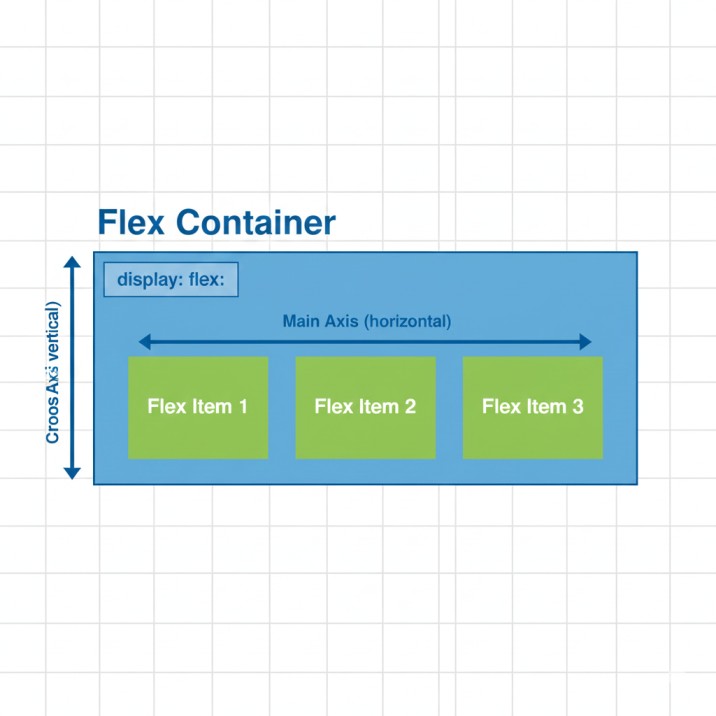
Every CSS Flexbox layout has two participants: the container and its items. This parent-child relationship is fundamental to how everything works.
CSS Flexbox Container Properties
When you declare display: flex on an element, it becomes a flex container with access to these powerful properties:
flex-direction sets your main axis. The default row creates horizontal layouts, while column stacks items vertically. You can also use row-reverse and column-reverse to flip the order. I frequently use column for mobile-first designs where vertical stacking makes perfect sense on smaller screens.
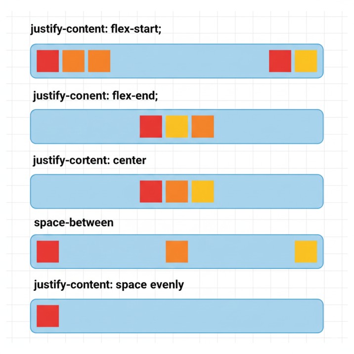
justify-content controls spacing along the main axis. Beyond basic options like flex-start, center, and flex-end, you get space-between (items pushed to edges with even spacing), space-around (breathing room on all sides), and space-evenly (perfectly uniform gaps). For navigation menus, I almost always use space-between to create that professional, balanced look.
align-items handles the cross-axis (perpendicular to your main axis). The default stretch makes items fill the container’s height, center vertically centers everything, flex-start aligns to the top, and baseline aligns text baselines across items of different sizes. Last week, I used baseline alignment for a pricing table where card heights varied but feature lists needed perfect alignment.
flex-wrap determines whether items stay on one line or wrap to new rows/columns. Set it to wrap for responsive designs where items should break into multiple lines rather than overflow. Combined with other CSS Flexbox properties, this creates layouts that adapt intelligently to any screen size.
align-content controls spacing between wrapped lines (only matters when flex-wrap is active). It uses the same values as justify-content but applies to the cross-axis spacing between rows or columns.
CSS Flexbox Item Properties
Individual items get their own controls for fine-tuned behavior:
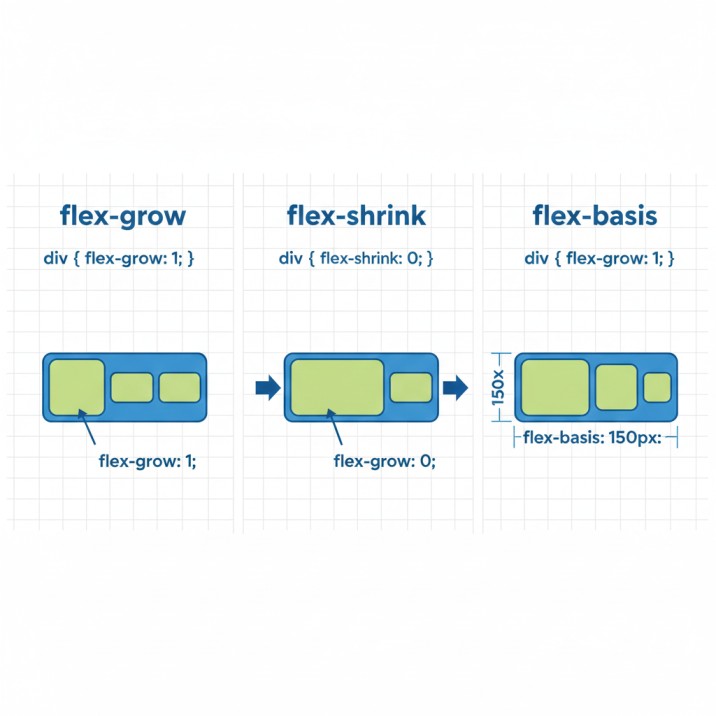
flex-grow accepts a number (default 0) determining how items consume extra space. Set one item to flex-grow: 2 and another to flex-grow: 1, and the first grabs twice as much available space. This proportional distribution works beautifully for dashboard layouts with a dominant main content area and modest sidebars.
flex-shrink controls compression when space gets tight (default 1). Set it to 0 to prevent shrinking entirely—perfect for logos or icons that should maintain their dimensions. Higher values allow more aggressive compression.
flex-basis sets the initial size before growing or shrinking occurs. Think of it as the item’s starting point. You might use flex-basis: 200px for sidebar navigation or flex-basis: 0 for pure proportional distribution based on flex-grow values.
flex shorthand combines all three: flex: 1 1 auto means “grow if possible, shrink if necessary, start at natural content size.” The common shorthand flex: 1 translates to “fill available space equally”—I use this constantly.
align-self overrides the container’s align-items for individual items. This helps when one card needs different alignment, like a “featured” badge that should stick to the top while others center.
order changes visual order without touching HTML structure. Default value is 0; negative values move items earlier, positive values move them later. Useful for responsive designs where layout priority changes between mobile and desktop.
Real-World CSS Flexbox Applications
Let’s explore actual scenarios where CSS Flexbox isn’t just useful—it’s the perfect solution.
Building Responsive Navigation Bars
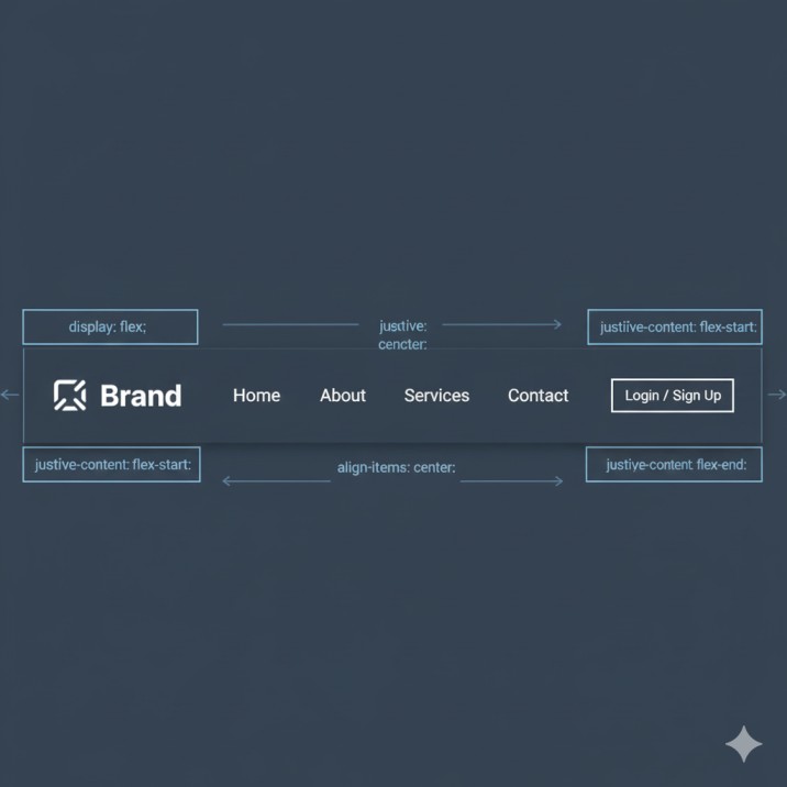
Navigation bars used to require width calculations, float clearing, and careful positioning. With CSS Flexbox, create a container with display: flex and justify-content: space-between. Your logo snaps left, menu items distribute evenly across the center, and a login button sits perfectly at the right edge. Add align-items: center and everything vertically centers automatically, regardless of element heights.
For mobile responsiveness, use flex-direction: column inside a media query. Your horizontal nav becomes a vertical menu instantly, with all CSS Flexbox properties working seamlessly in both orientations.
Creating Flexible Card Layouts
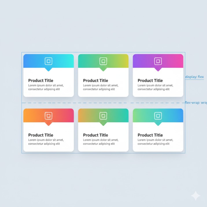
E-commerce sites, portfolio galleries, team member pages—card layouts appear everywhere. Set up a flex container with flex-wrap: wrap, give each card flex: 1 1 300px, and watch magic happen. Wide screens show multiple cards per row. Tablets display fewer. Phones stack vertically. No manual breakpoint calculations required.
The secret? Combine flex-basis with min-width and max-width. Cards grow and shrink within reasonable bounds while always looking intentional, never awkwardly stretched or squashed.
Solving the Holy Grail Layout
The classic three-column layout with header and footer stumped developers for years. CSS Flexbox makes it straightforward. Your main container gets display: flex and flex-direction: column. Header and footer have fixed heights. The middle section uses display: flex for horizontal columns, with main content set to flex: 1 consuming available width while sidebars maintain their dimensions.
This pattern works for admin dashboards, blog layouts, application interfaces—anywhere you need reliable structure.
Perfecting Form Layouts
Forms benefit enormously from CSS Flexbox. Apply display: flex to field groups, set labels to fixed width with flex-shrink: 0, and let inputs grow with flex: 1. Buttons align perfectly using align-self: flex-end or margin-left: auto to push them right.
For multi-column forms, wrap field groups in a flex container with appropriate flex-basis values. Fields stay aligned, spacing remains consistent, and responsive behavior happens naturally.
Common CSS Flexbox Mistakes to Avoid
Even experienced developers encounter these CSS Flexbox pitfalls:
Forgetting minimum size constraints: Flex items won’t shrink below their minimum content size by default. Long words or images might overflow. Set min-width: 0 or min-height: 0 on flex items to allow shrinking beyond content size.
Confusing main and cross axes: When using flex-direction: column, the main axis runs vertically, meaning justify-content controls vertical spacing while align-items handles horizontal alignment. This confusion happens constantly—I mentally swap these when working with columns.
Overcomplicating with nested containers: Sometimes developers create multiple layers of flex containers when one level suffices. This adds complexity and unexpected behavior. Start simple, add nesting only when necessary.
Conflicting flex-shrink values: When multiple items have different flex-shrink values in limited space, results might surprise you. Be explicit about compression priority.
Ignoring the gap property: Modern CSS Flexbox supports gap for spacing. Instead of managing margins on items and removing them from first/last children, simply set gap: 20px on the container. Much cleaner.
CSS Flexbox vs CSS Grid: Choosing Wisely
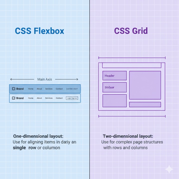
People constantly ask whether to use CSS Flexbox or Grid. The answer: both, applied strategically.
Use CSS Flexbox for:
- Navigation bars and menus
- Button groups and toolbars
- Card rows that wrap naturally
- Form field layouts
- Component-level designs
- Any one-dimensional layout (single row or column)
Use CSS Grid for:
- Overall page structure
- Image galleries with consistent sizing
- Complex dashboards with overlapping content
- Layouts requiring precise row AND column control
- Any two-dimensional layout
In practice, I use Grid for page-level structure and CSS Flexbox for components within that structure. A Grid-based layout might contain dozens of Flexbox-powered elements. They’re complementary tools, not competitors.
Advanced CSS Flexbox Techniques
Once you master basics, these advanced techniques unlock even more potential:
Margin auto for perfect alignment: Setting margin-left: auto on a flex item pushes it to the right edge. margin-top: auto pushes it to the bottom. This creates split navigation bars and footer layouts with minimal code.
Combining flex properties strategically: Use flex: 0 0 auto for fixed-size items, flex: 1 1 0 for equal distribution regardless of content size, and flex: 1 1 auto for content-proportional growth.
Creating responsive typography: Apply CSS Flexbox to text containers with align-items: baseline to ensure text aligns perfectly across varying font sizes and line heights.
Building complex navigation patterns: Combine multiple CSS Flexbox containers to create mega menus, dropdown systems, and multi-level navigation structures that respond beautifully to different screen sizes.
CSS Flexbox Performance Considerations
CSS Flexbox is remarkably efficient. Modern browsers optimize flex calculations well, even with hundreds of items. However, consider these scenarios:
Deeply nested flex containers (five or six levels) can slow layout calculations. If you’re nesting this deeply, restructure your approach. Excessive layout thrashing—JavaScript repeatedly reading and writing layout properties—causes issues regardless of layout method.
For lists with thousands of items, virtual scrolling (rendering only visible items) matters more than your choice of layout system. CSS Flexbox isn’t usually the performance bottleneck.
Browser Support and Compatibility
Modern CSS Flexbox enjoys excellent browser support. All current browsers fully support the standard syntax. Internet Explorer 11 has partial support with known bugs—test thoroughly if supporting legacy browsers. You can check the current browser support statistics for Flexbox to see the latest compatibility data across all browser versions.
For maximum compatibility, consider using autoprefixer to add vendor prefixes automatically.
Pro Tips from Real-World Experience
After implementing CSS Flexbox across hundreds of projects, here are time-saving insights:
Create utility classes: Maintain a set of flex utilities (.flex, .flex-center, .flex-between, .flex-column) for rapid development. Combine these classes instead of rewriting properties repeatedly.
Test with realistic content: CSS Flexbox behaves differently with short text versus long paragraphs, small images versus large ones. Always test with actual content variations, not lorem ipsum and placeholder boxes.
Use developer tools effectively: Browser DevTools show flex properties visually. Chrome and Firefox highlight flex containers and display alignment properties, making debugging infinitely easier.
Document your flex patterns: When you solve a tricky CSS Flexbox layout, document it. Create a component library or pattern reference. Your future self (and teammates) will thank you.
Frequently Asked Questions About CSS Flexbox
Can CSS Flexbox handle entire page layouts?
Yes, many websites use CSS Flexbox exclusively. However, CSS Grid often provides cleaner solutions for complex page structures. Most modern sites combine both approaches.
How do I center elements with CSS Flexbox?
Set the parent to display: flex, then use justify-content: center and align-items: center. The child centers both horizontally and vertically—simpler than old transform/positioning tricks.
Does CSS Flexbox work in all browsers?
All modern browsers fully support CSS Flexbox. Internet Explorer 11 has partial support with bugs. For legacy support, test thoroughly and implement fallbacks where necessary.
Why aren’t my flex items the same height?
By default, align-items: stretch makes items equal height. If you’ve overridden this or set explicit heights, they’ll differ. Check for conflicting properties on child elements.
When should I use CSS Flexbox vs CSS Grid?
Use CSS Flexbox for one-dimensional layouts (rows OR columns). Use CSS Grid for two-dimensional layouts (rows AND columns simultaneously). Often you’ll use both in one project.
Conclusion: Master CSS Flexbox Today
CSS Flexbox transformed web layout from a collection of hacks into an elegant, purposeful system. You don’t need to memorize every property combination—start with fundamentals, build real projects, and patterns become second nature.
Developers who master CSS Flexbox build faster, debug less, and create more maintainable code. They stop fighting against CSS and start working with it. Whether you’re building your first website or refactoring a legacy application, CSS Flexbox belongs in your essential toolkit.
Start with a simple navigation bar. Then try a card layout. If you want to practice in a fun way, try this interactive Flexbox game that teaches properties through gameplay. Experiment with alignment properties until everything clicks.
Ready to level up your frontend skills? Implement CSS Flexbox in your next project today. Your code will be cleaner, your layouts more flexible, and your development process significantly faster.
Transform Your Web Projects with Expert Development
Struggling with complex layouts or need a complete website overhaul? Our agency specializes in modern, responsive web development using cutting-edge CSS techniques like Flexbox and Grid. We build clean, maintainable websites that look stunning on every device and load lightning-fast.
Whether you’re launching a new product, redesigning your brand presence, or scaling your existing platform, our team delivers pixel-perfect implementations backed by years of real-world experience with CSS Flexbox and modern web standards.
Let’s discuss your project. Contact us today for a free consultation and discover how professional development makes the difference.
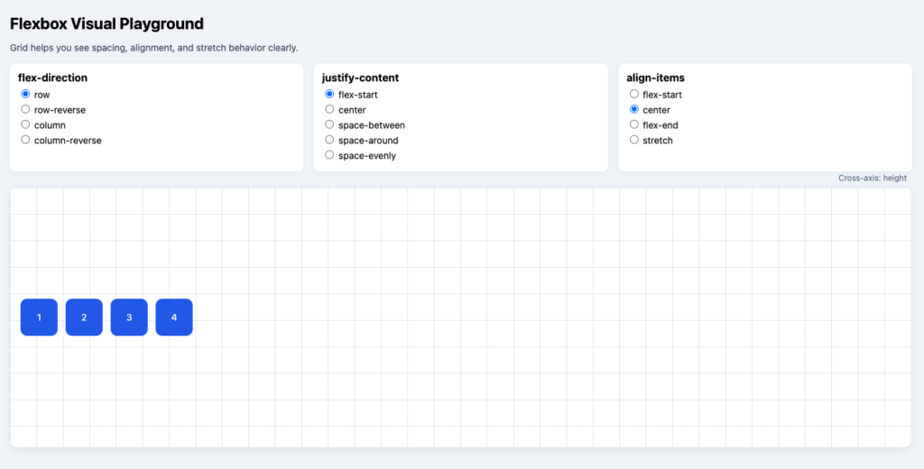
Visual Playground